We reflect on our growth, evolution, and ambitious plans.
The new name dmpagency.cz s.r.o. better reflects our direction and commitment to providing quality services in the field of e-commerce for our B2B and B2C clients.
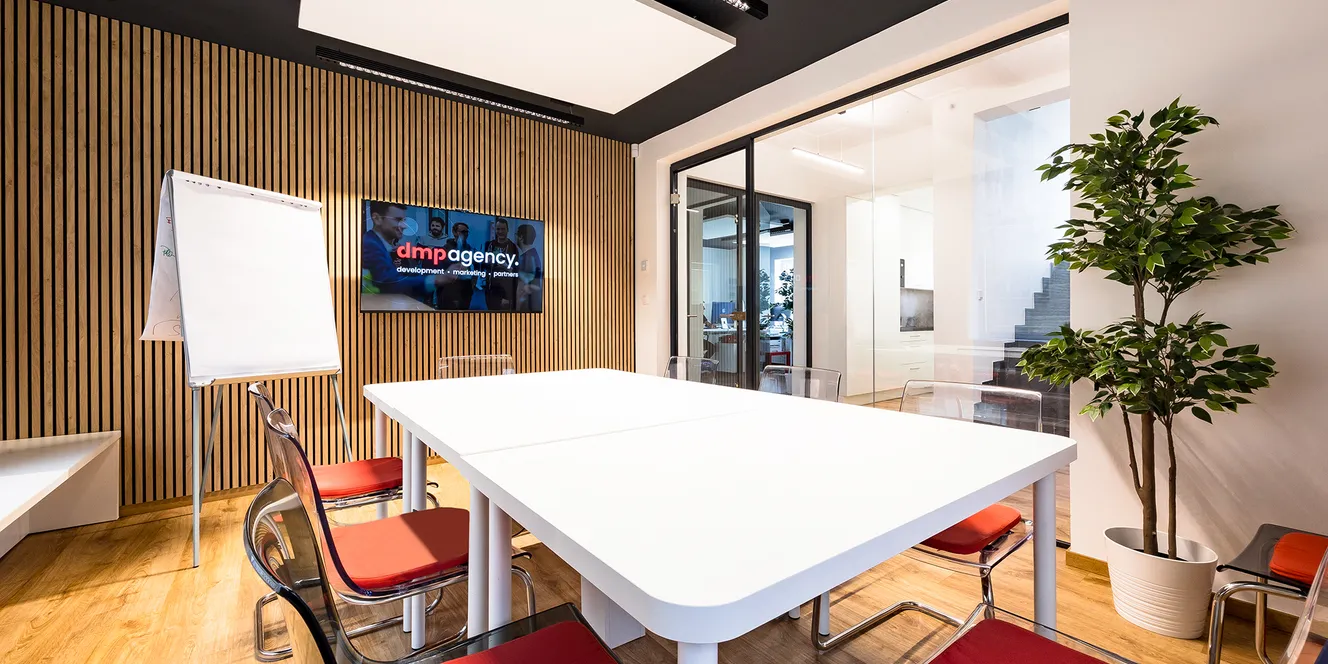
Our goal is to become a leading digital agency in Central Europe, delivering innovative e-commerce services in the form of modern e-shops, custom IT development, and performance marketing.
Bold colors, dynamic lines, and modern design reflect our passion for creativity, innovation, and ambition to achieve our goals.


We are online.
The dot and circle symbols represent the globally connected world of the internet. The dot represents detail and part of the URL address. The circle illustrates the complexity of our creative process and the services we provide.
These simple symbols visually enrich our communication with abstract elements.


Modern typography
We use the dynamic sans-serif font Poppins, which is clean and designed for online use. For longer block texts, we chose Arial for its good readability and compatibility across platforms. Website loading speed is crucial, and therefore the native Arial font provides excellent performance.
Poppins & Arial
We may not be located in Silicon Valley, but we have Grandmother's Valley in Ratibořice and the beautiful nature of the Giant Mountains and the Orlické Mountains, which is why we love it here so much.
Although we don't reside in Silicon Valley, we have Grandma's Valley in Ratibořice and the beautiful nature of the Krkonoš and Orlické mountains, which is why we love it here so much. The new highway connection also shortens our journeys to Prague, Wroclaw, and even Berlin, opening up new opportunities for our work and leisure.
Selected styles
Regular
Semibold
Bold
Confident color palette
The selected color palette builds on the traditional color of our brand over the past 12 years. At the same time, we have revitalized the shade of red and given it a more modern touch. Red symbolizes our passion for innovation, creativity, and the energy we strive to infuse into every project. The complementary black color adds confidence and a solid foundation to the appearance. Shades of gray provide the palette with balance and stability, which we also aim to reflect in our relationships and business partnerships.
Change that brings new possibilities
The new visual identity supports our goal of becoming a significant digital agency in the field of e-commerce in Central Europe. We want to be a reliable partner for our clients and help them grow sustainably and meaningfully in the context of new online trends and challenges.


Thank you for your trust
Finally, we would like to thank you for your trust and support so far. You are not just clients to us, but partners on a shared journey of growth and innovation. We look forward to further cooperation and achieving new shared challenges and successes.

 Welcome, I am AIadin, your guide on our website ✨